Burnt rubber and blood red
Download Press Package: Low-res | High-res
Share this project +
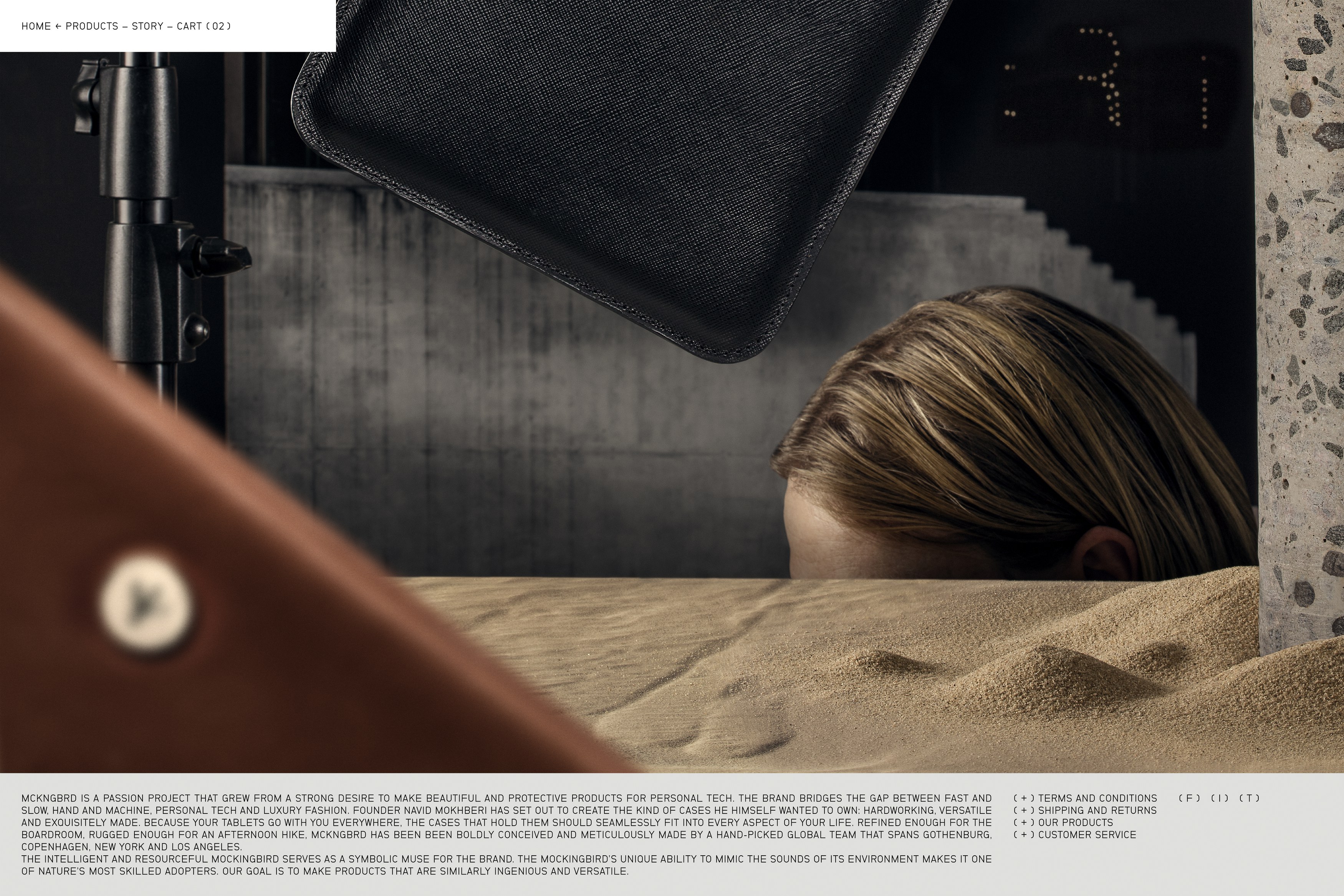
MCKNGBRD is a passion project that grew from a strong desire to make beautiful and protective products for personal tech. The brand bridges the gap between fast and slow, hand and machine, personal tech and luxury fashion. Founder Navid Mokhberi has set out to create the kind of cases he himself wanted to own: hardworking, versatile and exquisitely made. The brand’s premium cases are designed to be 'refined enough for the boardroom, yet rugged enough for an afternoon hike'.
We have been working with MCKNGBRD since 2014, when the company was founded. Our initial project for the brand* encompassed naming and the design of the visual identity, including a range of printed pieces.
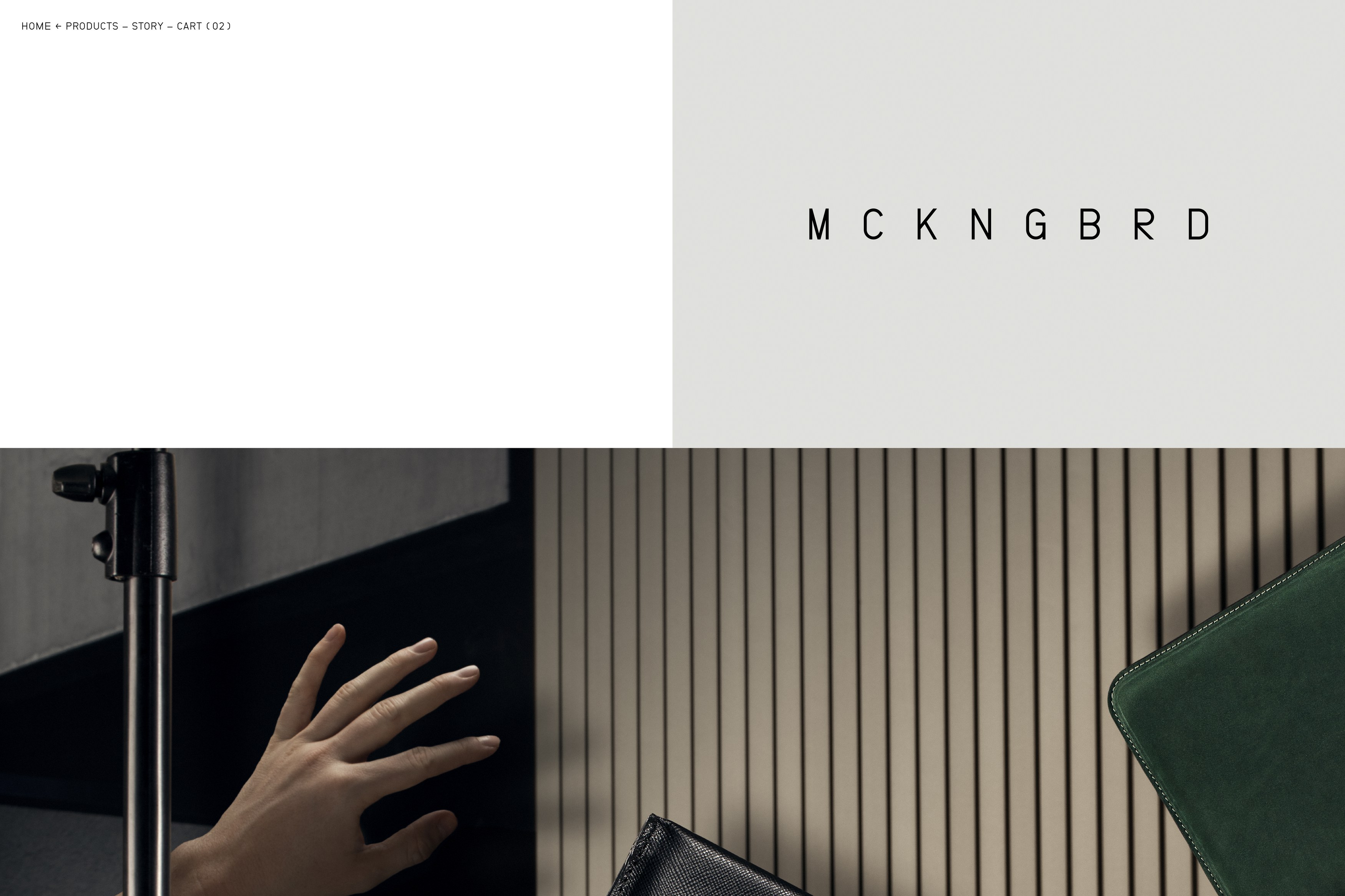
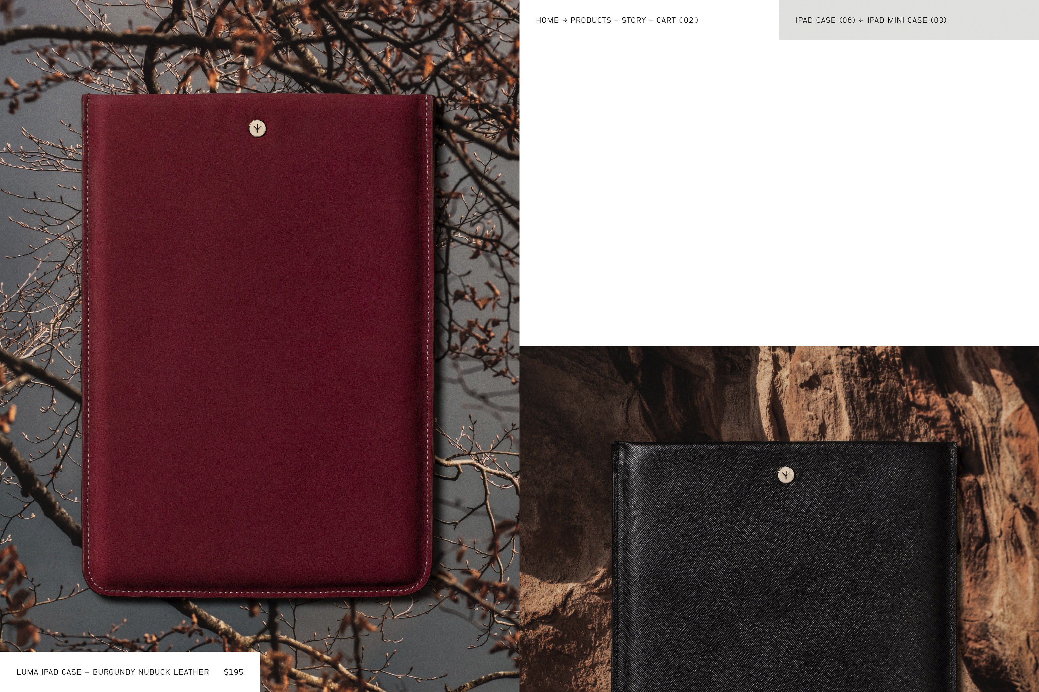
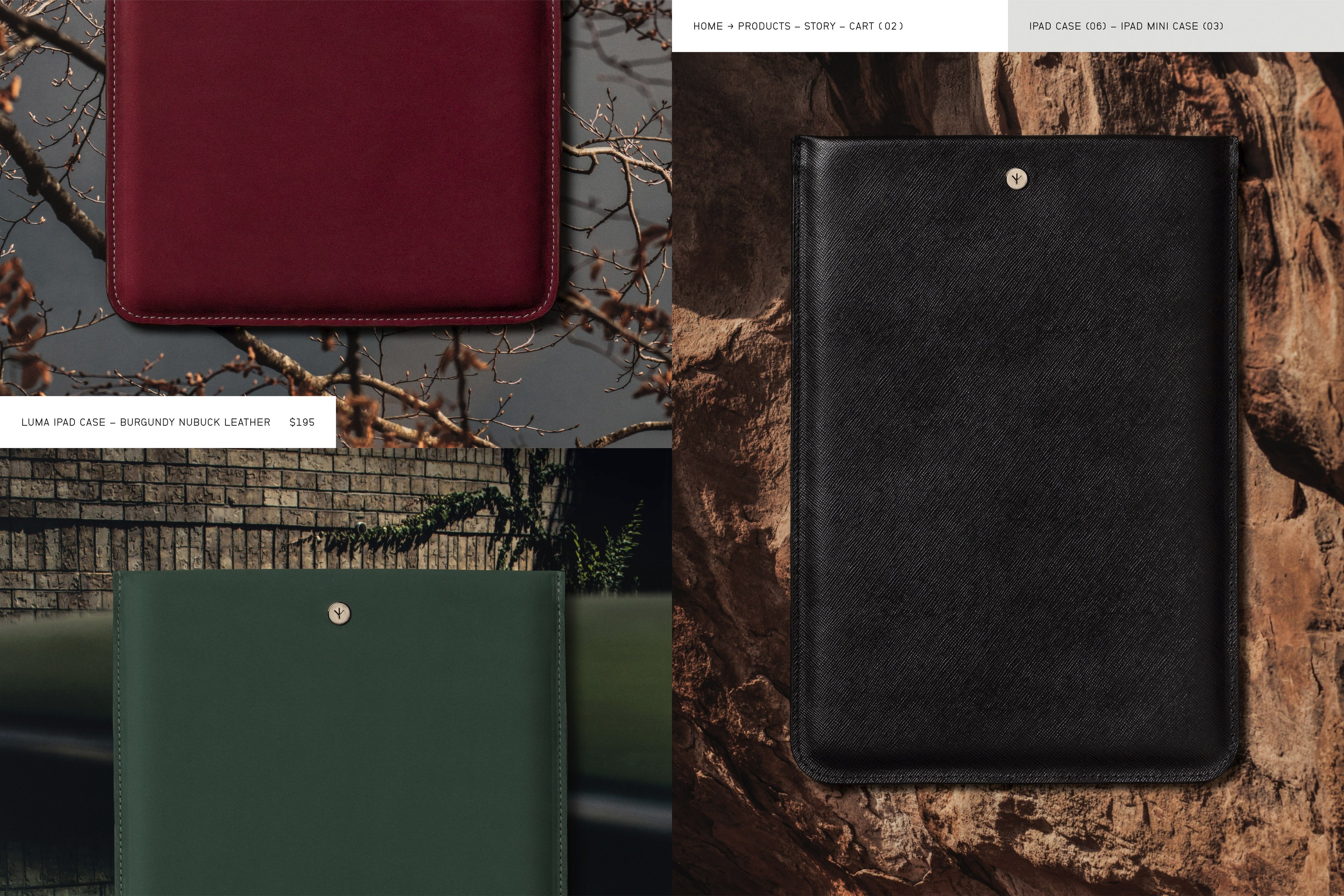
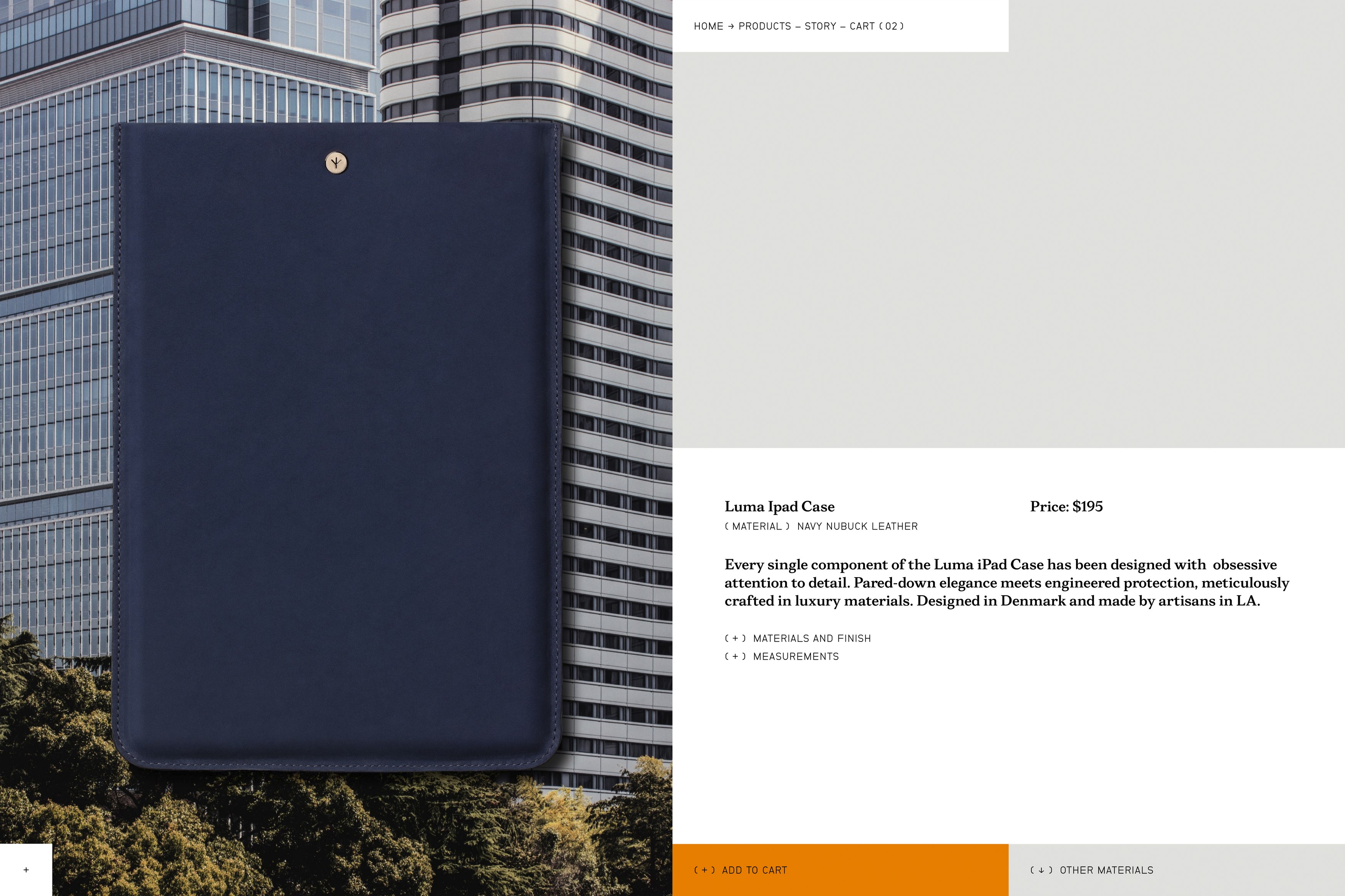
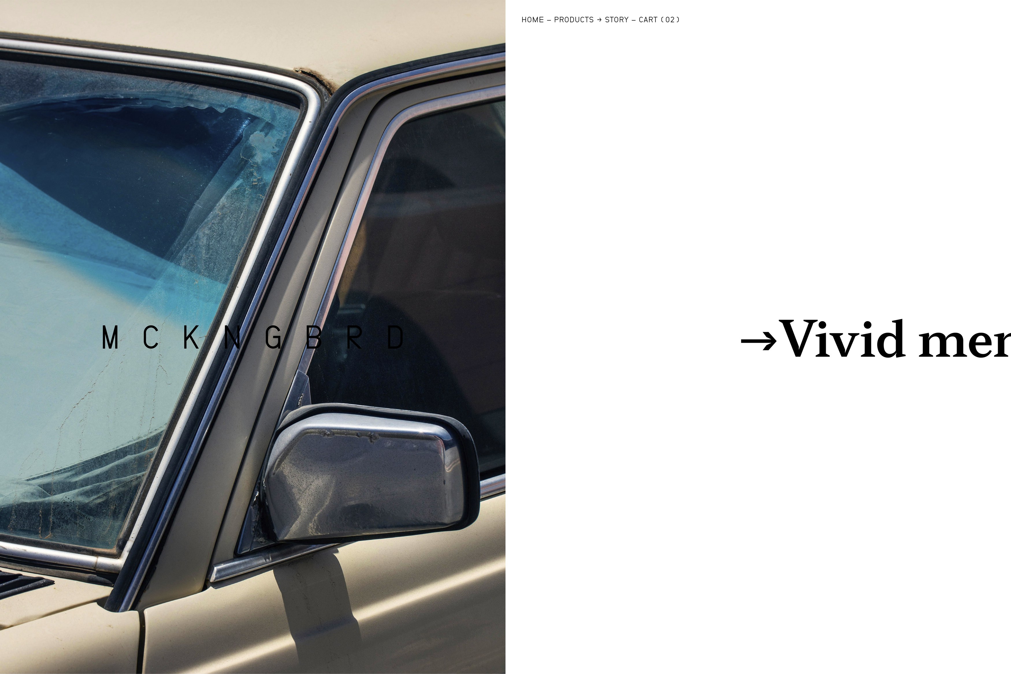
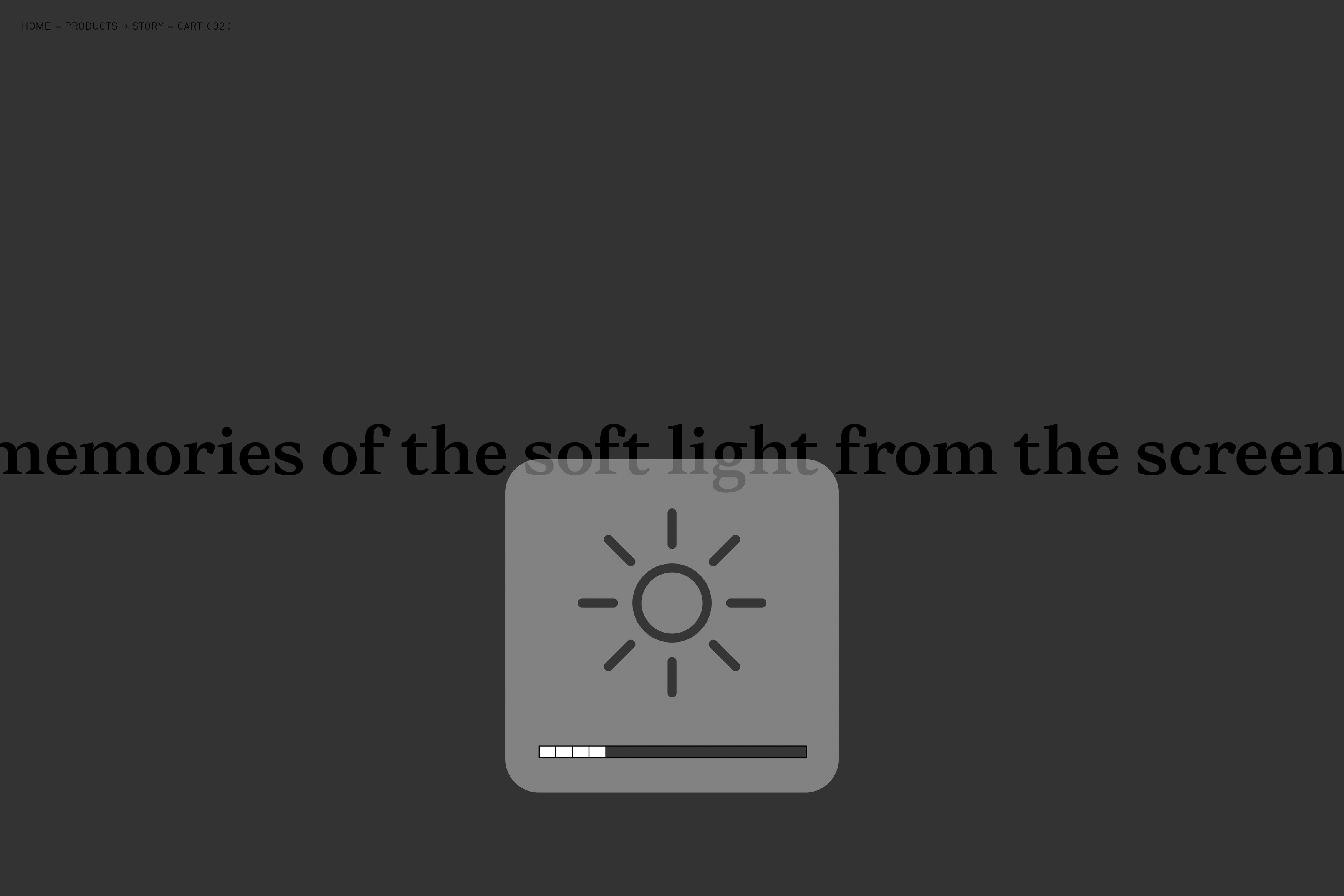
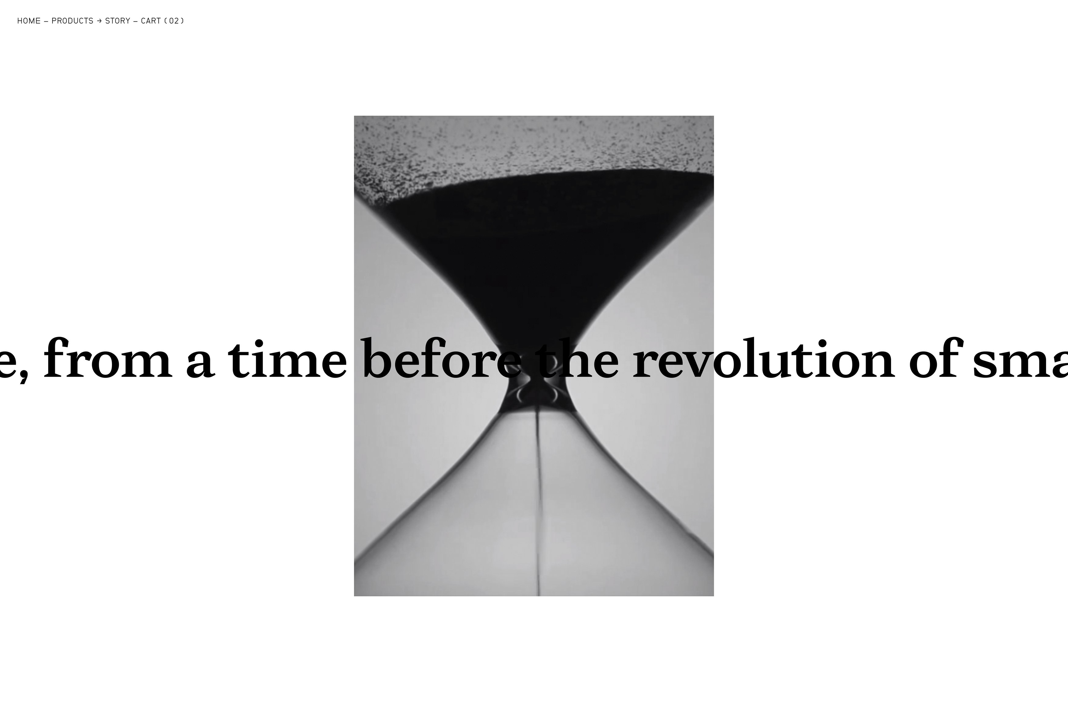
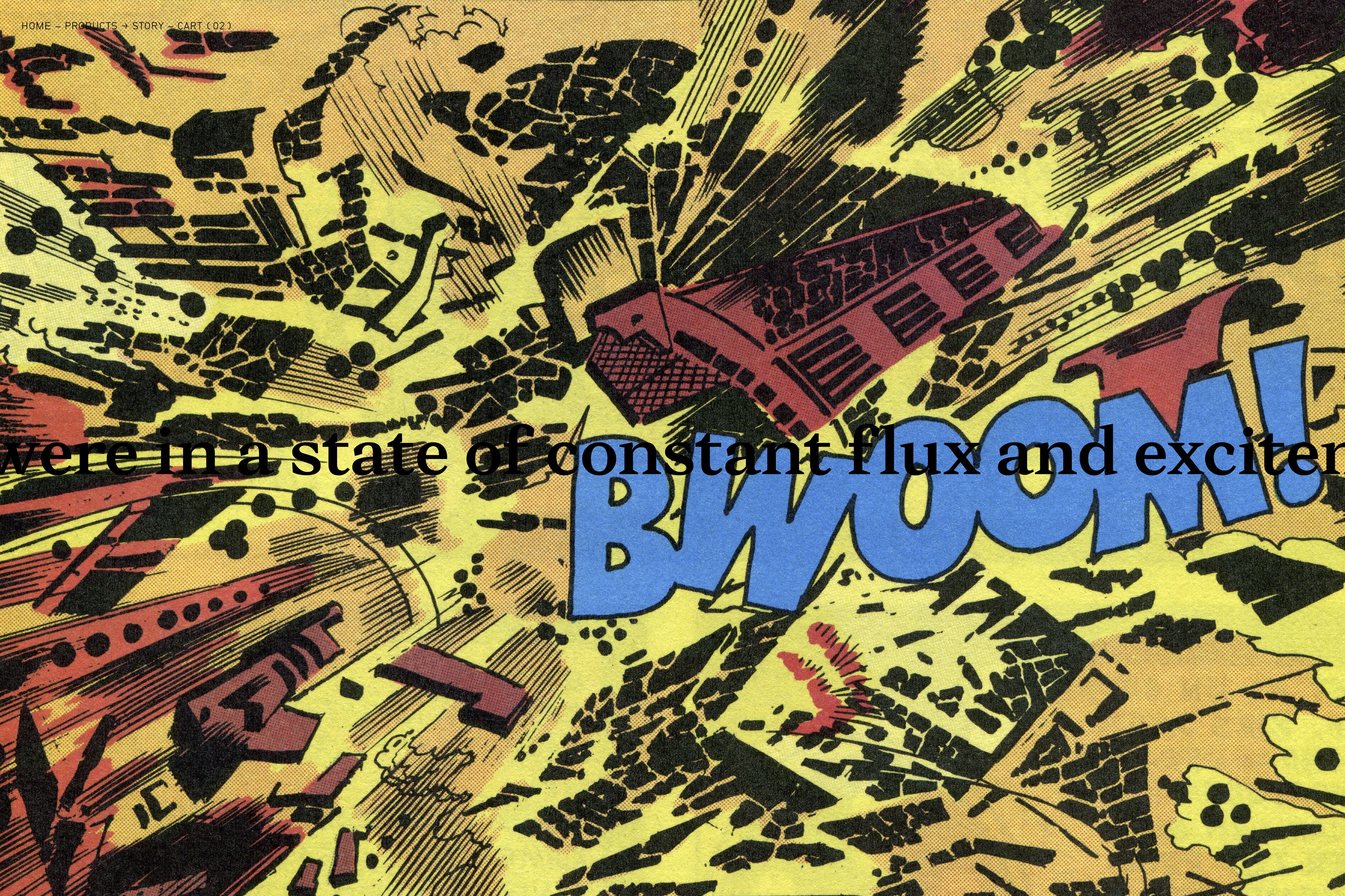
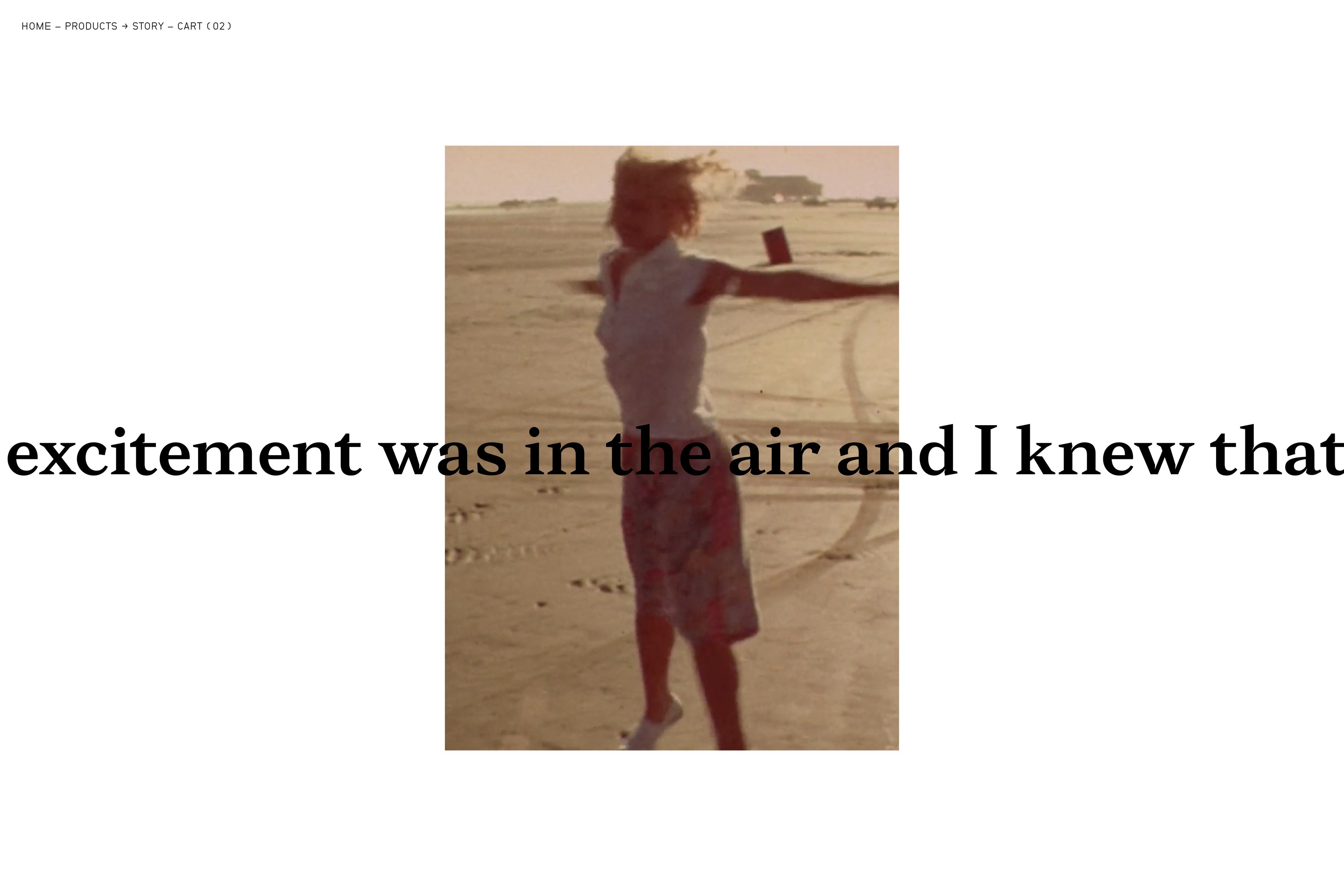
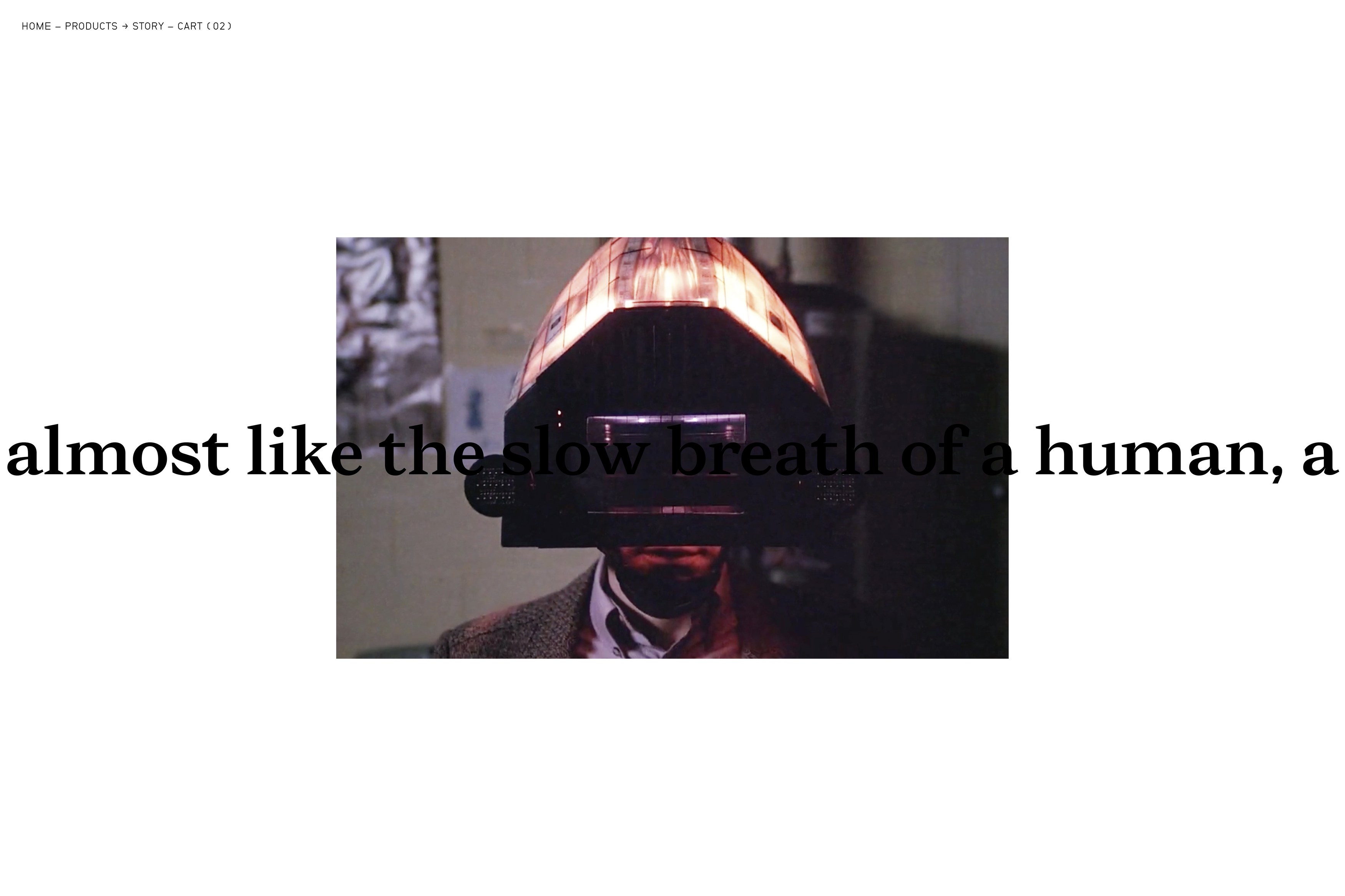
As the product development reached its final stages in the Autumn of 2018, we were commissioned to design and develop an e-commerce platform and brand site for MCKNGBRD. The site is built around two main sections; the Shop and the Brand. While the Shop section employs a modular grid with forced asymmetrical shifts, the brand section tells the story of the brand in a continuous, single line of type travelling horizontally (desktop). Throughout this stream of consciousness, the text is continually intersected by images and videos, illustrating the story. This collage of imagery was painstakingly sourced, collected and scanned from old comics, magazines and films. The text is based around story provided by MCKNGBRD’s founder, which we rewrote and reformatted for the website.
A bespoke typeface, called MCKNGBRD Serif (SemiBold), was designed in collaboration with type designer Tor Weibull. The typeface is used for display purposes across the site and most prominently in its Story section.
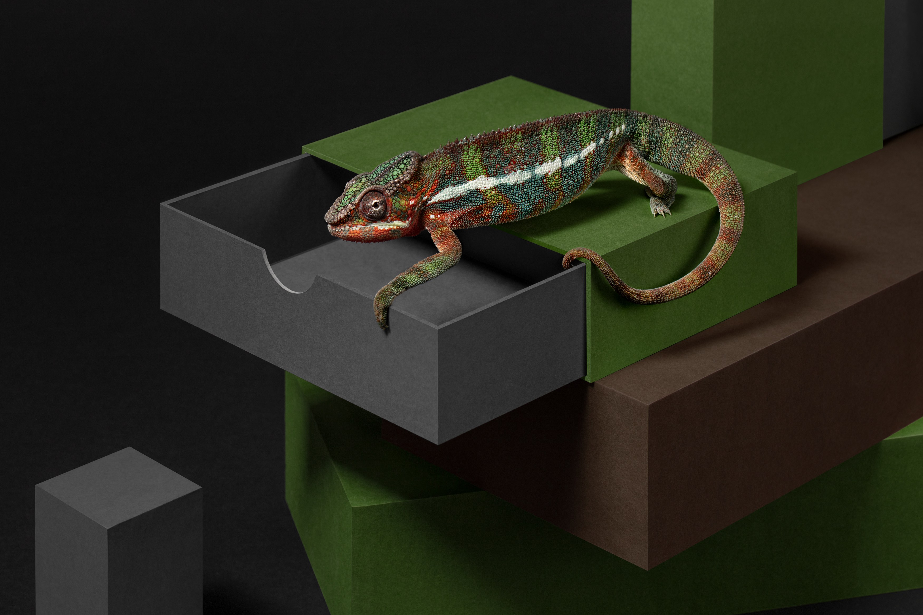
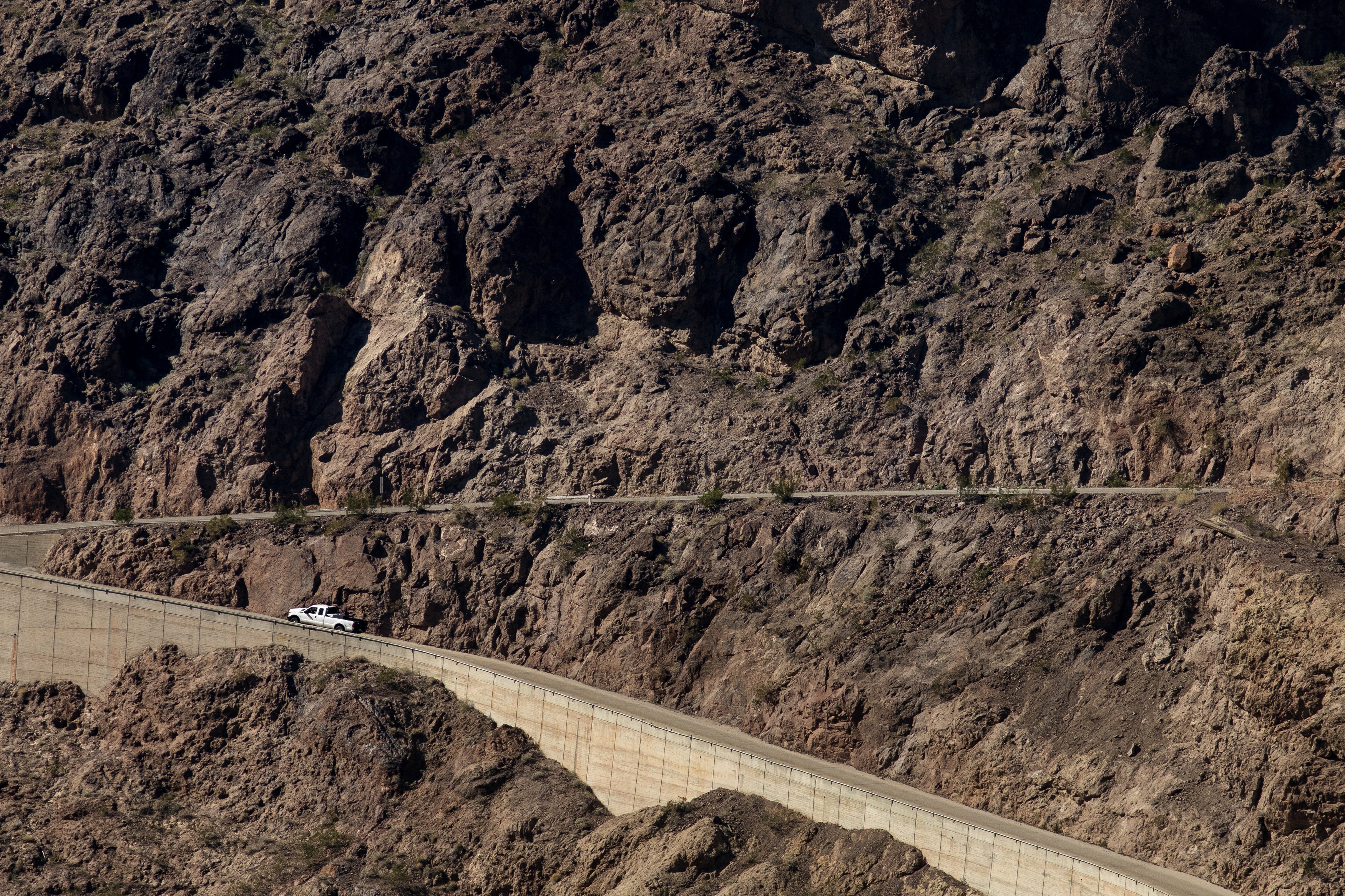
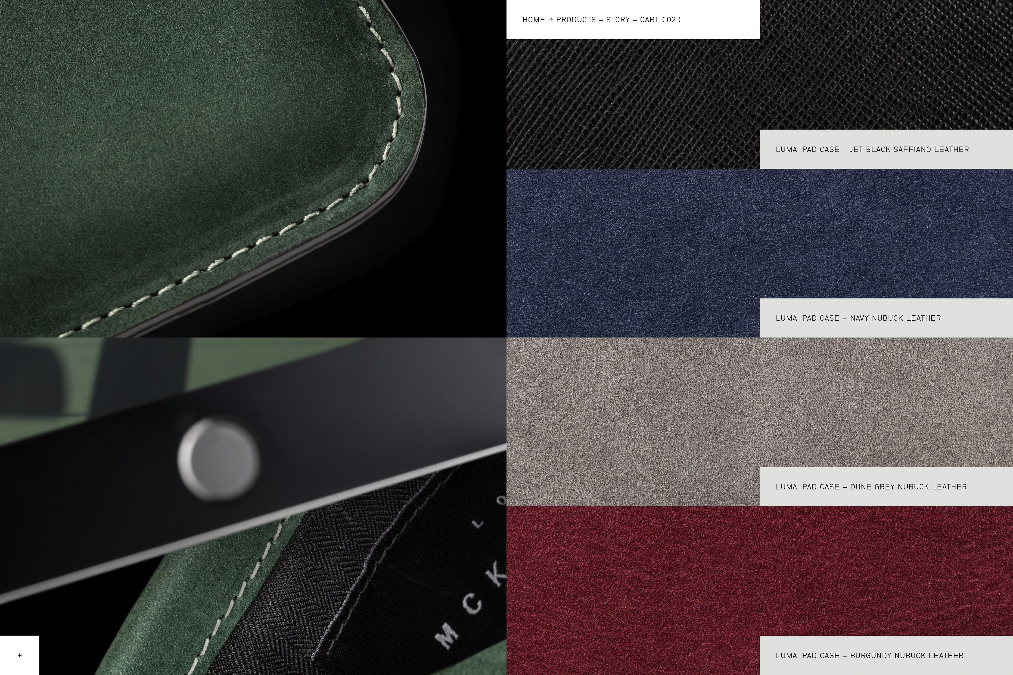
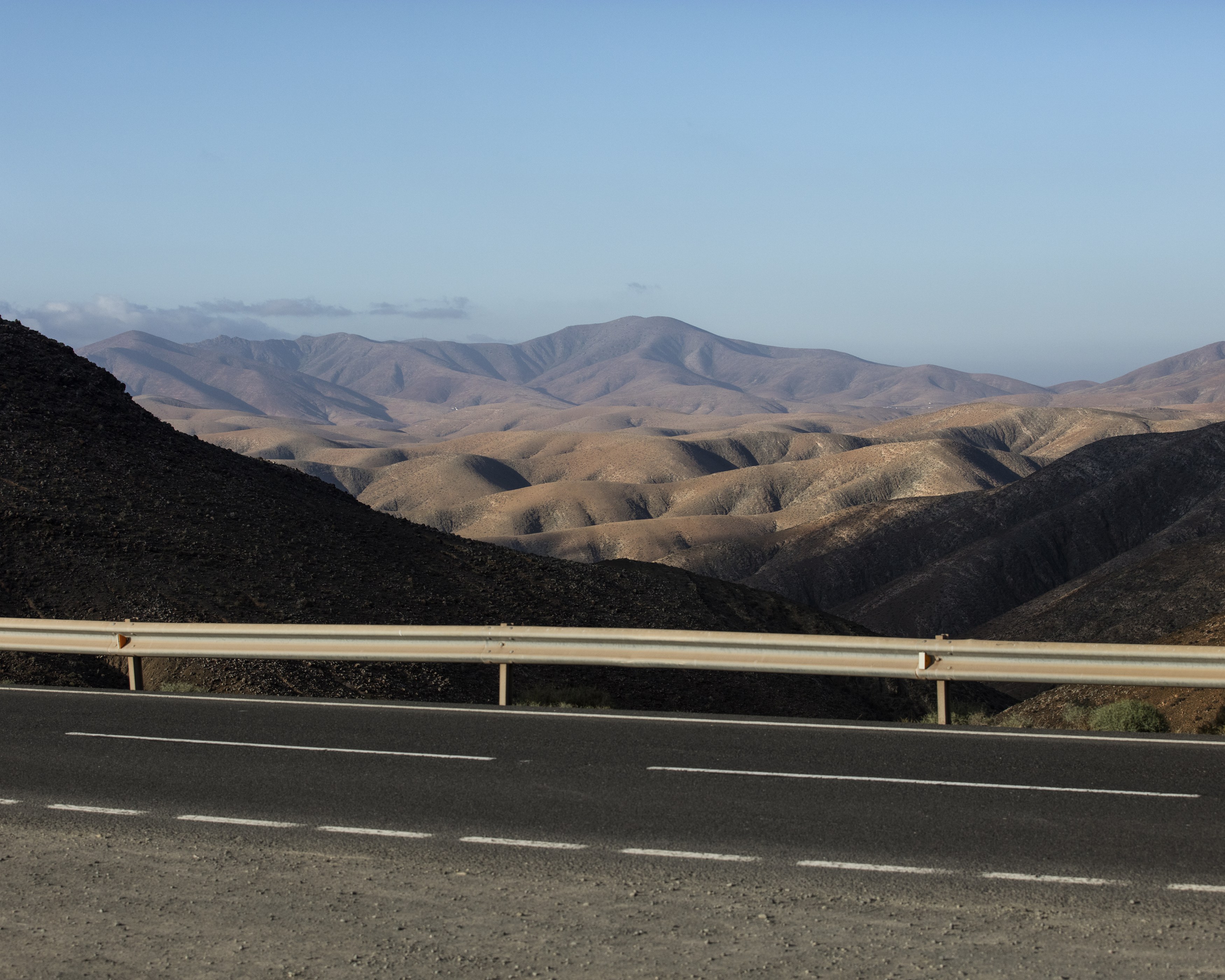
Additionally, we art directed a series of photoshoots, both encompassing the product imagery for the webshop and campaign focused images. Here, we worked closely with photographers Carl Oliver Ander and Erik Gustafsson, who both move seamlessly between the worlds of art and commerce. For the product imagery, we aimed to emphasise the adaptability of the products by superimposing them on large format printed image backgrounds. The image backgrounds were all shot by Ander on numerous locations around Europe and in the US. Much like the Mockingbird’s ability to mimic the sounds of its environment, making it one of nature’s most skilled adopters, the images create a tromp l'œil, where it is sometimes hard to distinguish between 2D and 3D. The campaign images expands on this idea, with multiple layers of images and physical objects creating a theatre-like set for the products.
Additional campaign imagery was shot by Erik Gustafsson, who employed his signature snapshot style and made a visual diary of a day and night with the cases. To amplify the distinction between the two types images, these were all shot on film, leaving physical discrepancies and applying only very moderate editing in post-production.
We work continously with MCKNGBRD as they enter new markets and as their product catalogue keeps growing.
